Push through pressure, go beyond limits.
ฝ่าแรงกดดัน ก้าวข้ามทุกขีดจำกัด
The exhibition presents Digital Media through the language of cooking from inspiration, through method, to the experience created for the audience.
Overcooked refers to the intense pressure before achieving the perfect result. This concept mirrors the hard work and dedication of the students during their thesis projects.
From primary setting the concept to initial sketches.
Techniques and professional practice.
Outcome resulting from creating the exhibition.
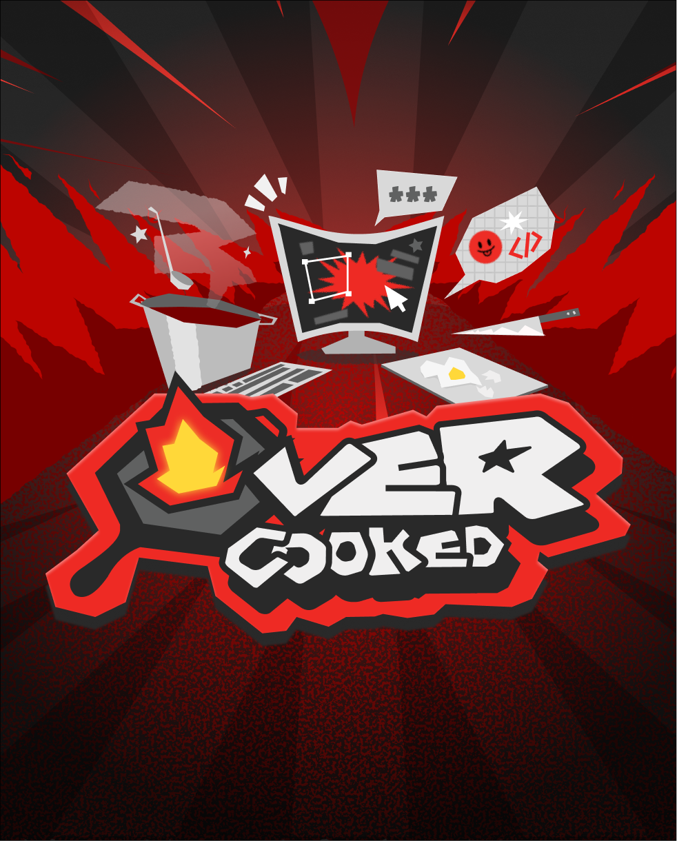
Our logo uses a custom sans-serif typeface with a handwritten-like feeling. The letterforms are tightly spaced, asymmetrical, and intentionally imperfect, creating a playful, bold, and flexible feel. This approach gives the logo a sense of energy, movement, and unpredictability.
A flaming pan replaces the letter ‘O’ in ‘Overcooked’, symbolizing heat, intense creativity, and the burning passion behind this exhibition.
Red is chosen as the primary color to represent chaos, overflowing energy, and exciting fun. Off-white and black are used to add depth to the logo and to represent the atmosphere of an industrial kitchen, chaotic yet structured, intense yet controlled.
The exhibition presents Digital Media through the language of cooking from inspiration, through method, to the experience created for the audience.
Overcooked represents the intense process behind digital media creation. From repeated thinking, testing, and problem solving. Similar to how a dish is developed before it is ready to be served.
To show the audience the importance of visual storytelling through various media.
To create a new experience that enhances the insight and understanding of the digital media works.
To showcase student talents through innovative tech and digital tools.
To provide a network of professional creators for exchanging ideas and collaborations in the industry.